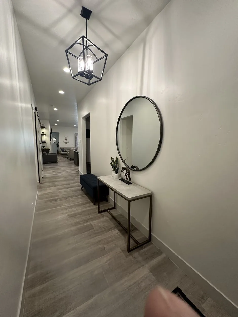
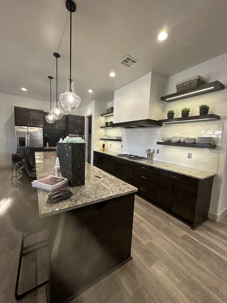
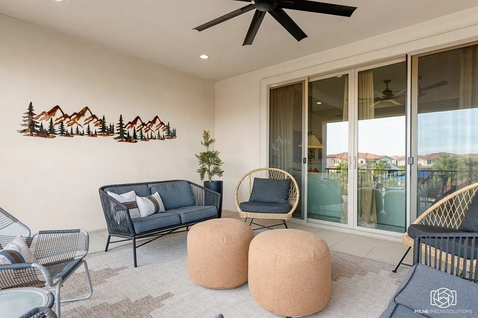
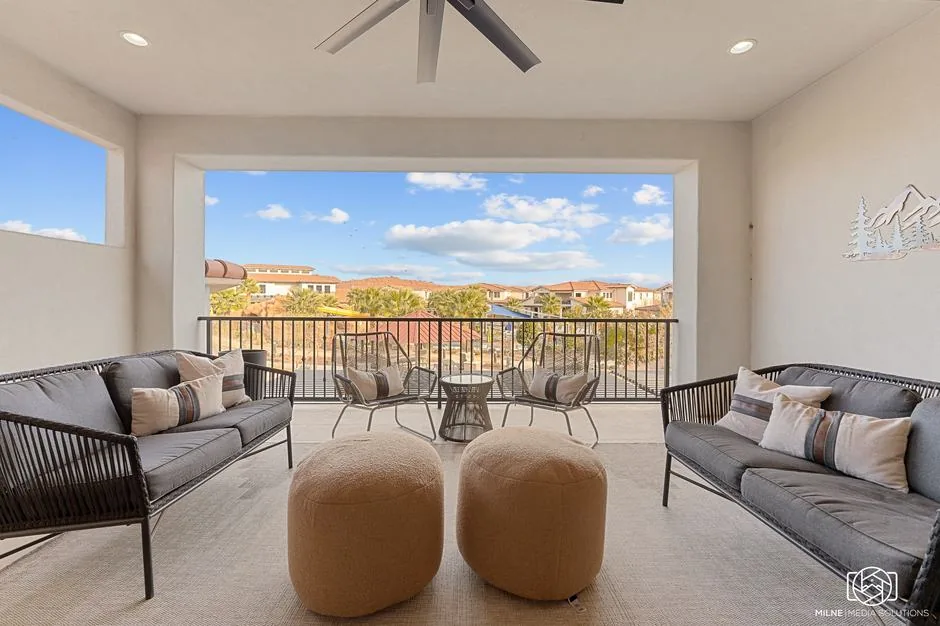
Hideout’s owners bought an existing vacation rental in the Arcadia community. It was about five years old, wasn’t booking the way they had hoped, and felt more modern than they wanted. They were after a Southwestern look, and our goal was to make the house feel cozy and inviting.
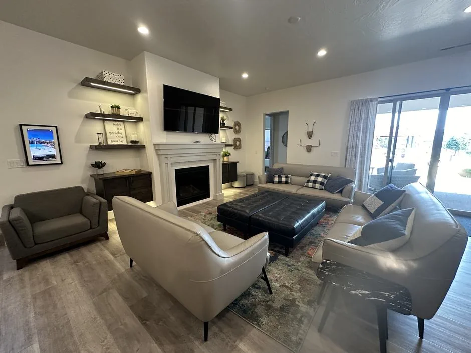
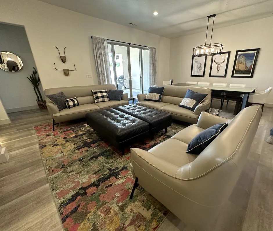
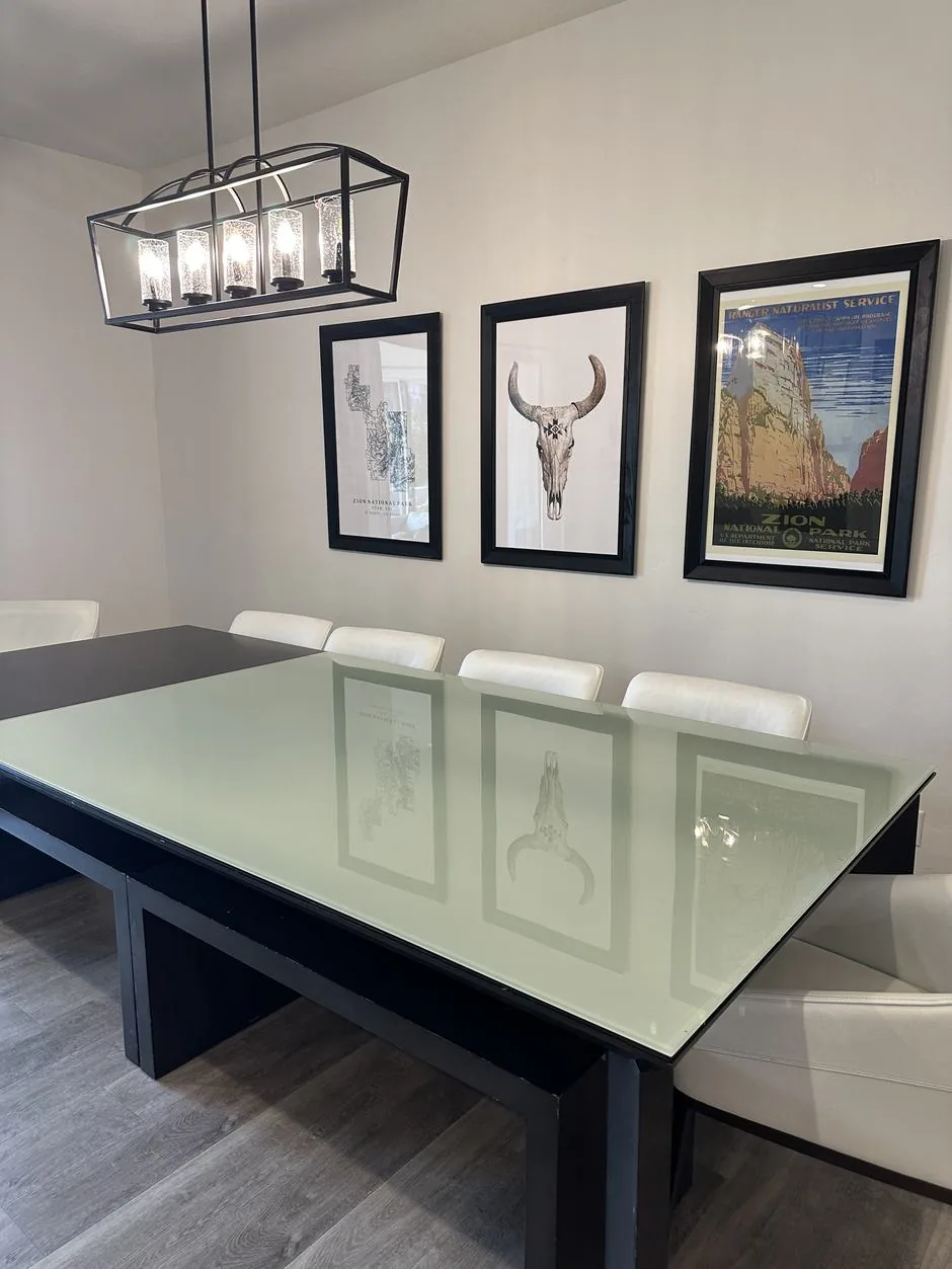
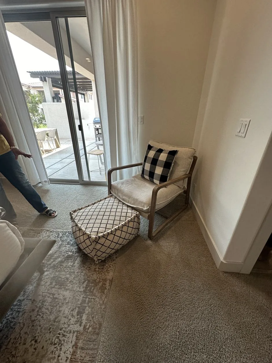
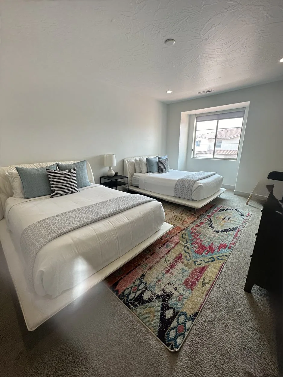
The house came furnished, and some of the furniture was expensive. A couple of the beds, two sofas, and the dining table and chairs came from a well-known Italian maker. Even so, the rooms felt cold. The floors were tile, the walls were a cool color, much of the furniture was gray and the windows had no curtains. Cool colors can work when warm wood or soft carpet balances them, but here everything leaned cool. It’s a good example of how a few expensive pieces can’t make a room inviting on their own. The floors, walls, windows and furniture all have to work together.
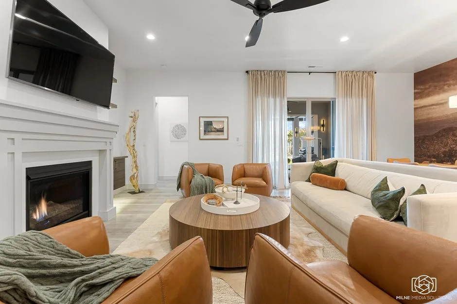
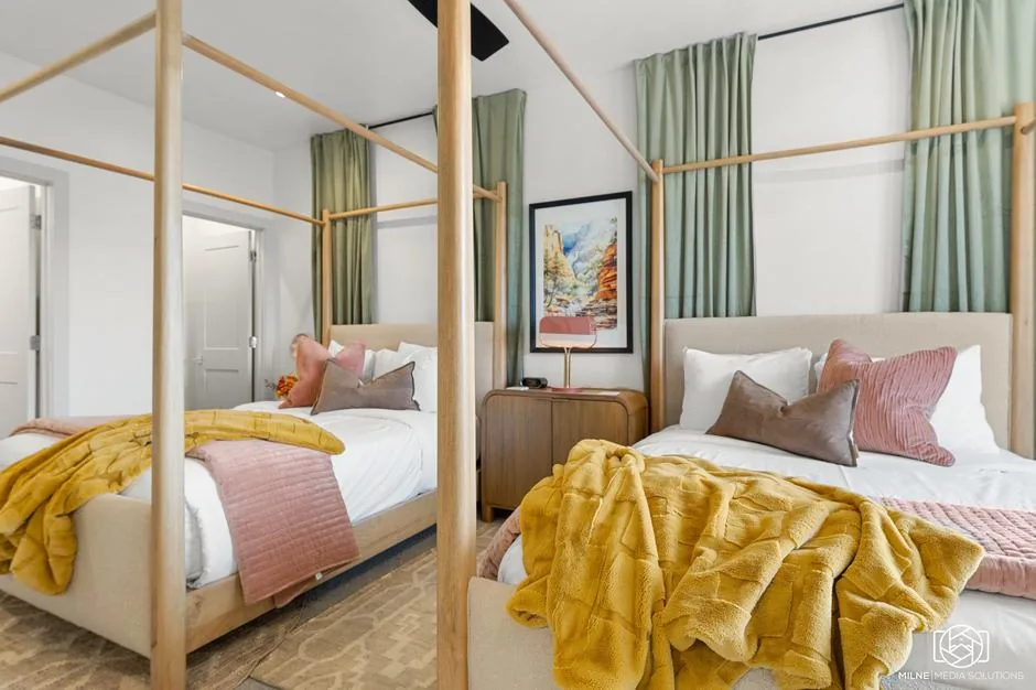
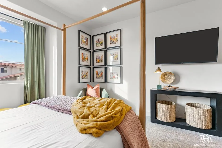
We kept most of the beds, the mattresses and the TVs, along with a few pieces of furniture. We swapped much of the rest for furniture in warmer tones to balance the cool floors and walls, brought in color, added curtains and upgraded the bedding.
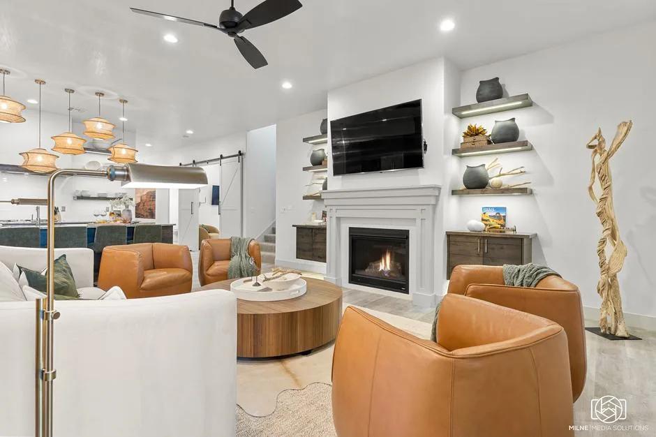
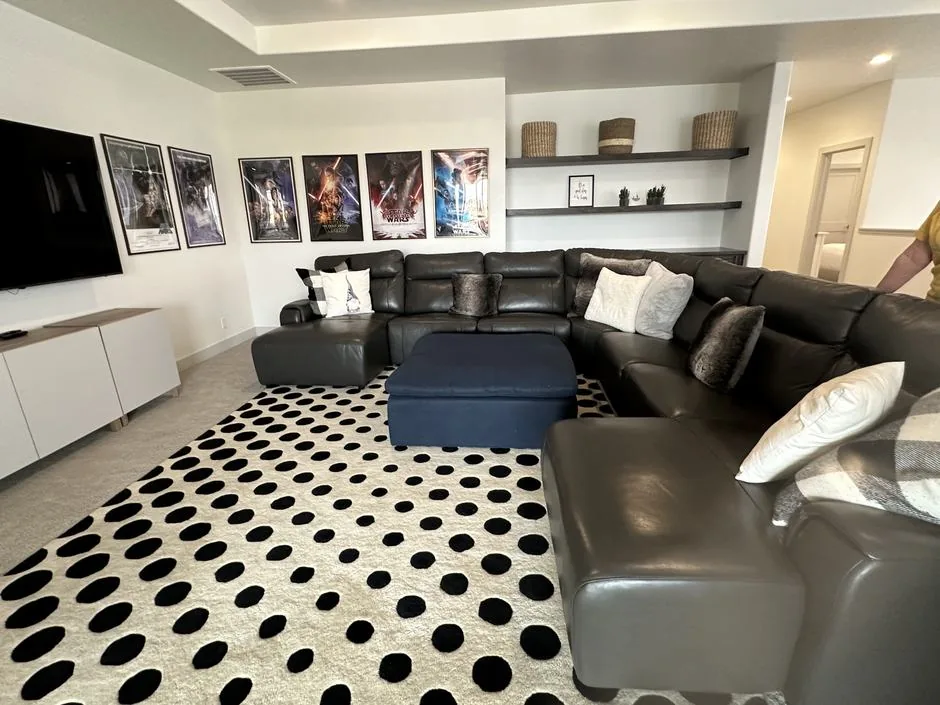
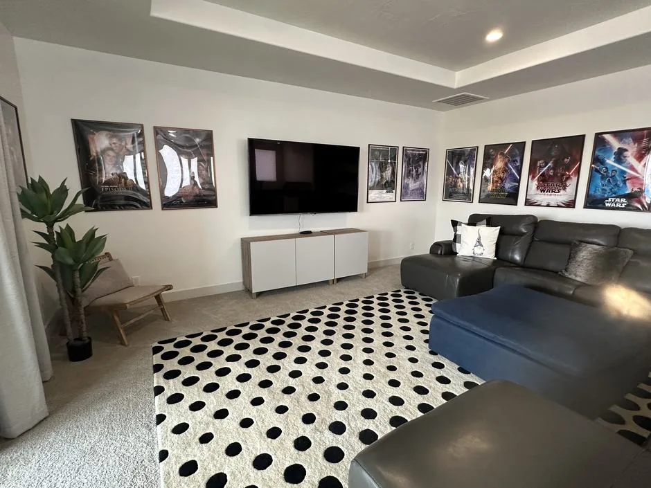
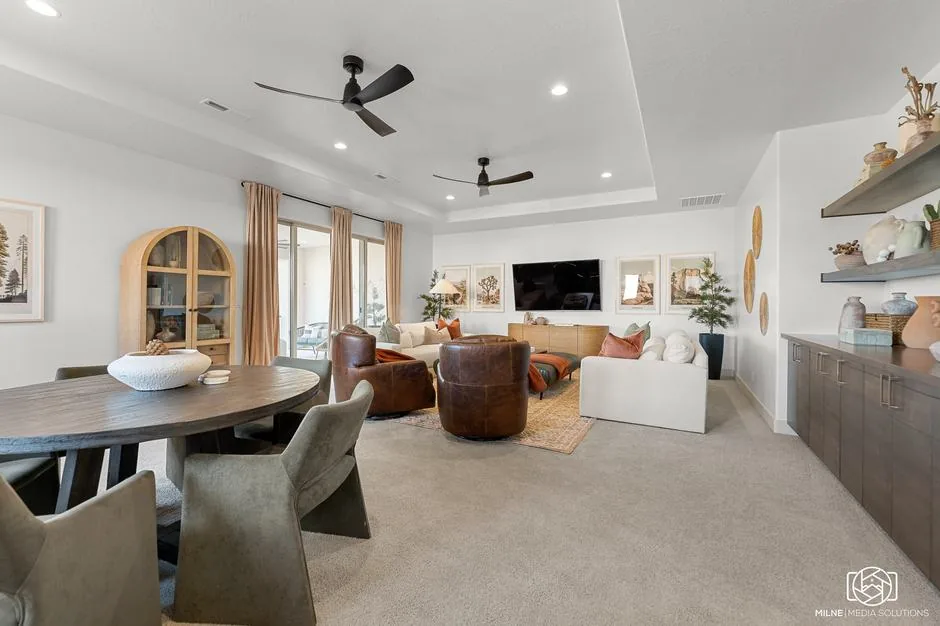
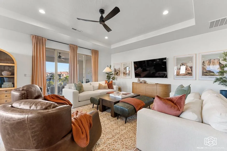
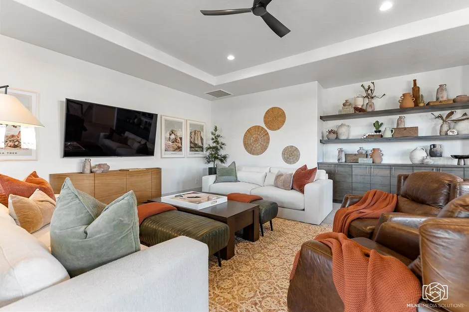
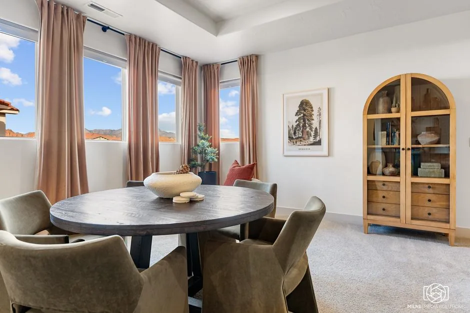
Upstairs, a large sectional faced the TV with its back to the stairs. You had to walk all the way around it to sit down, and the game table behind it sat off on its own. We replaced the sectional with two sofas and two swivel chairs around big coffee tables. Now there’s an easy way in, and people at the game table and in the seating area can talk and move between them.
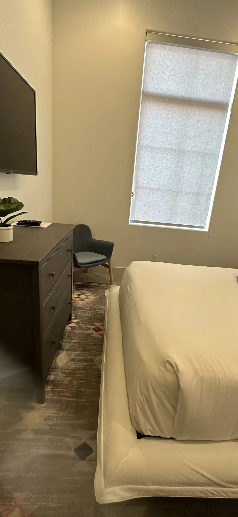
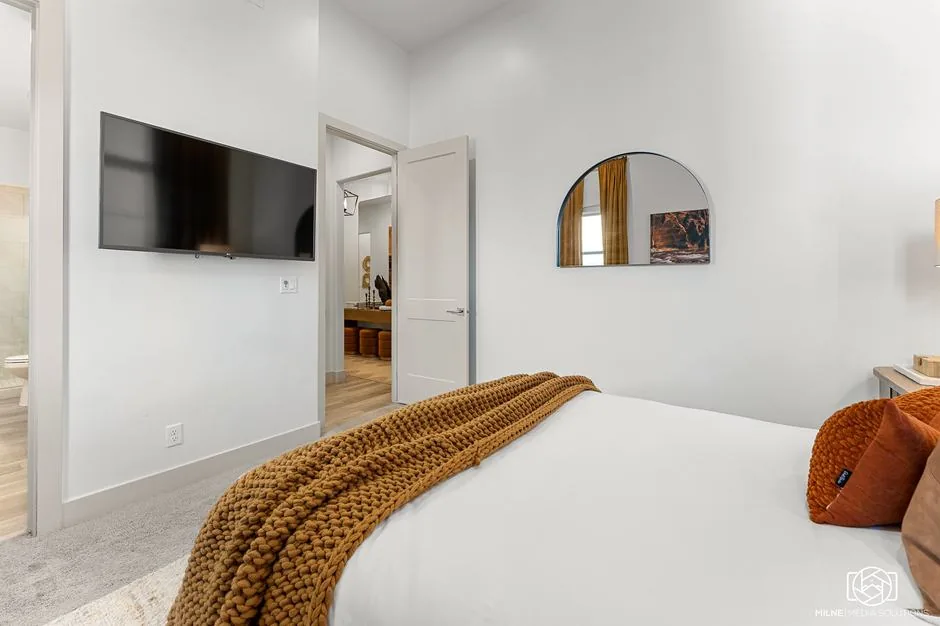
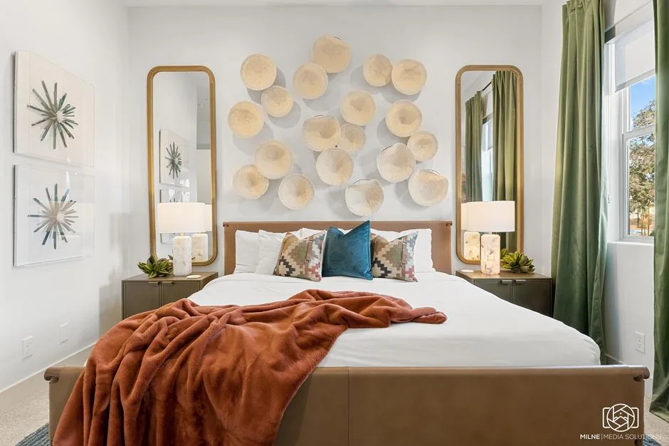
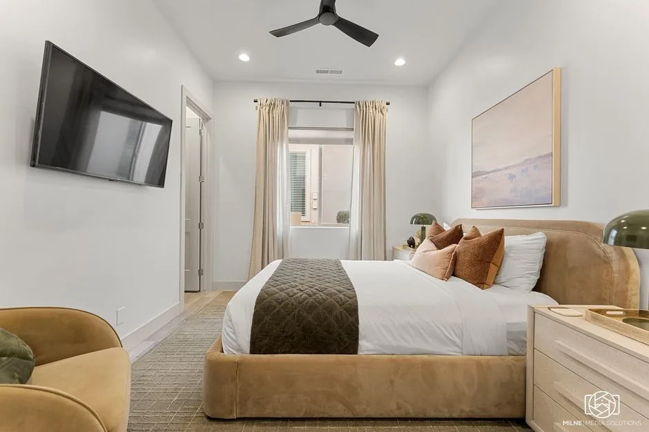
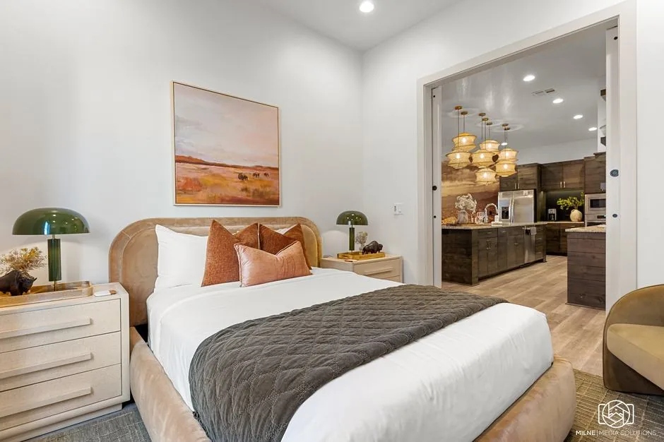
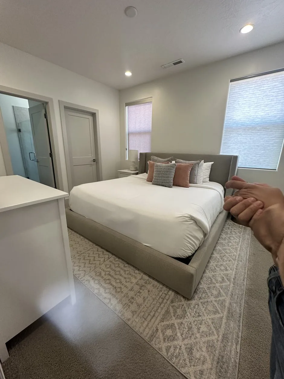
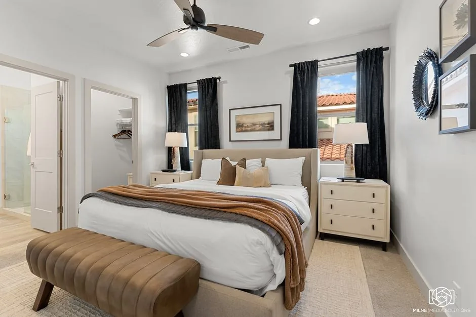
In the bedrooms, we try to fit a nightstand on both sides of the bed. When you’re traveling, you want your phone, a glass of water and any morning medication within reach, and a single small nightstand makes a room feel less thought through. In one room, the bed and a big dresser made the entrance tight. The room had a good closet, and guests stay only a few days, so the dresser wasn’t needed. We took it out, rotated the bed and used nightstands with drawers instead. The room was always a good size, and now it feels that way.
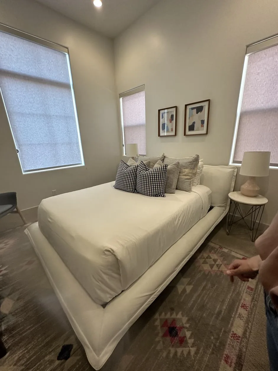
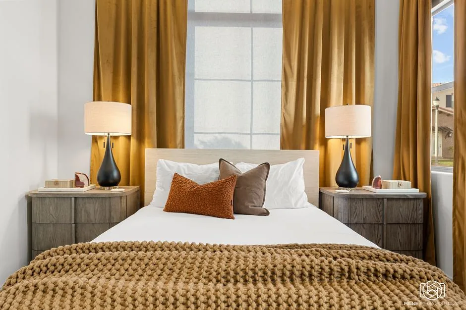
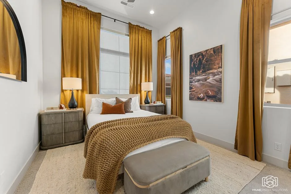
Another bedroom had one very tall window and two shorter ones. The bed sat between the windows, where a second nightstand would have blocked the bathroom door. We’d usually avoid putting a bed in front of a window, but here it was the only spot with room for two nightstands and a clear path to the bathroom. We pulled the bed out a little so it wouldn’t feel crammed, and matching curtains on all three windows make that wall feel grand.
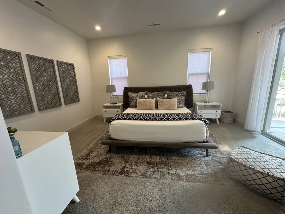
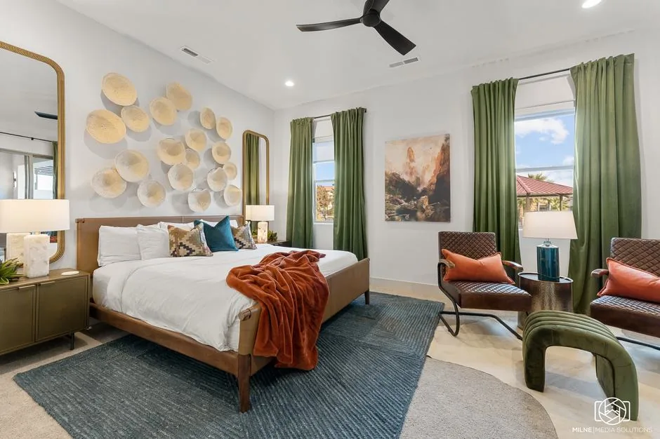
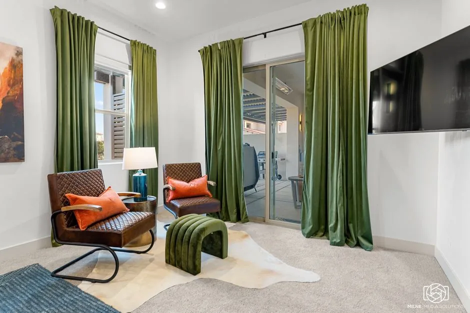
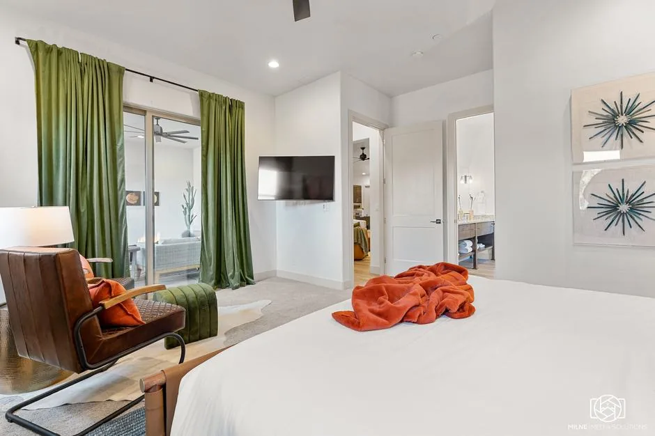
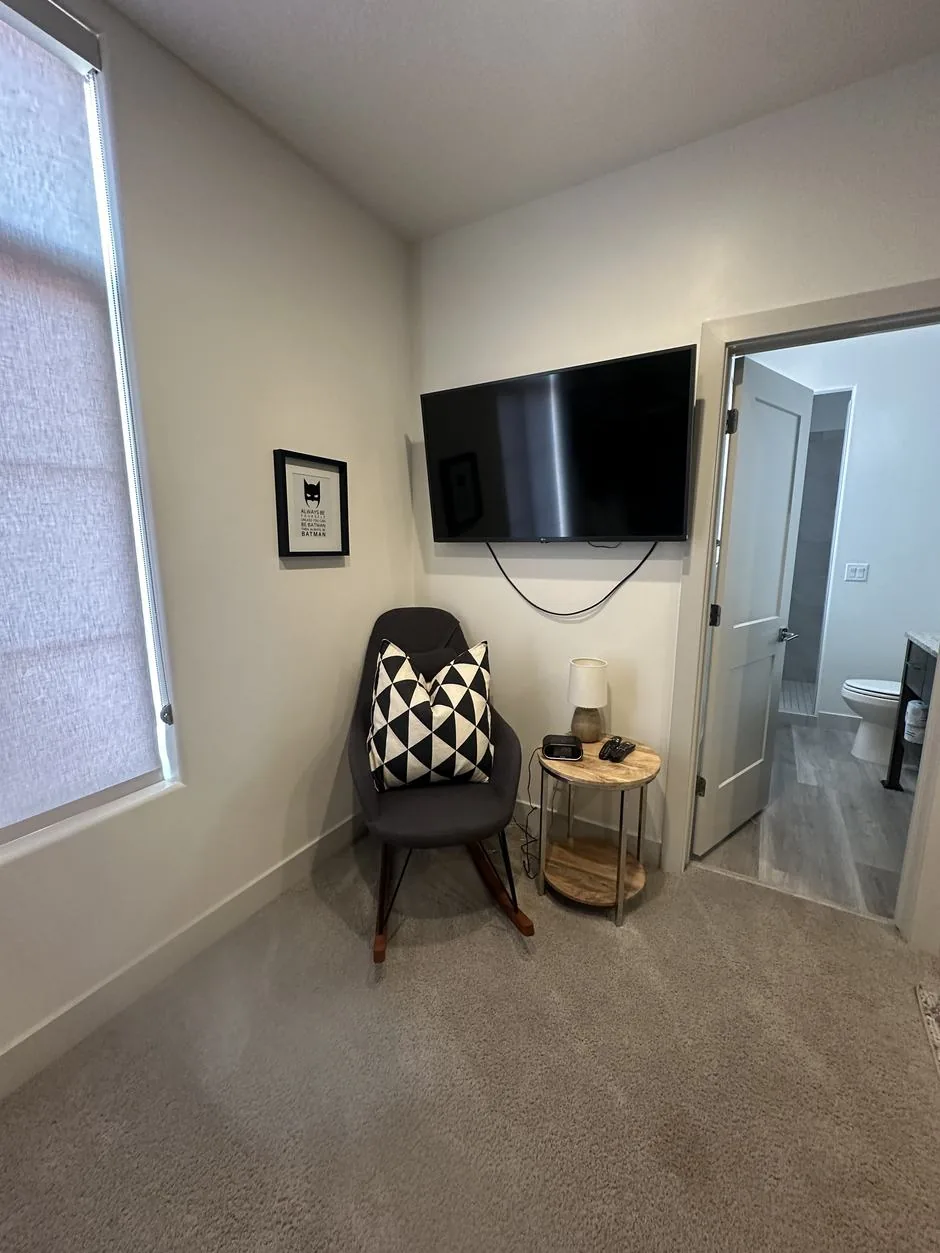
In the primary bedroom, the bed sat in the middle of the room, which left both sides too tight to use. We moved it to one side and set up a separate seating area with the TV, so guests have somewhere to relax besides the bed.
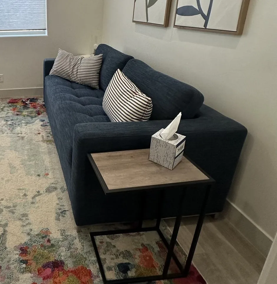
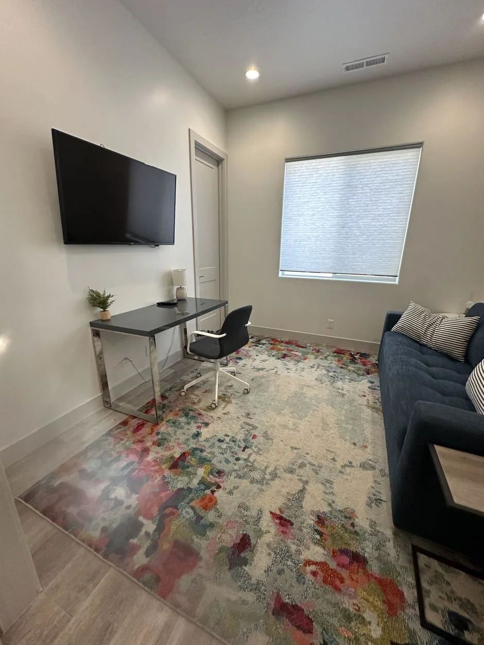
The owners told us the sofa bed in the den was almost always pulled out. Guests were using it as a bed, and not a comfortable one, so together we turned the den into a bedroom. Groups compare sleeping arrangements, and a listing that puts two people on a pull-out can lose to one where everyone gets a bed.
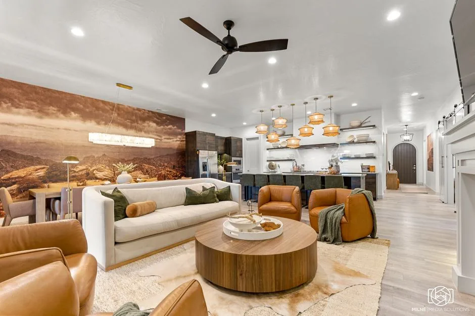
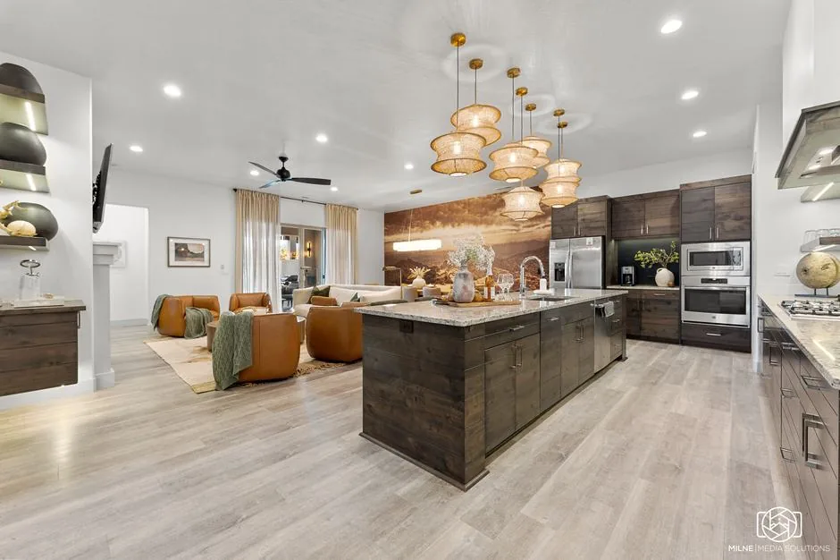
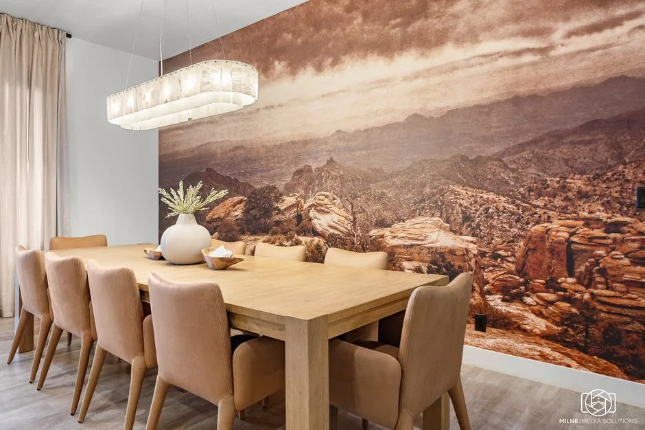
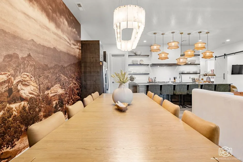
On the main floor, the ceilings are 10 feet high, but most of the decor sat at furniture height, with a long, mostly bare dining wall above it. We put a large canyon mural on that wall, so the design now reaches the ceiling. The house also had lots of small accessories, including little cacti. Under ceilings that tall, small pieces start to look like clutter, so we used fewer, larger pieces sized to the room. The space feels more open as a result.
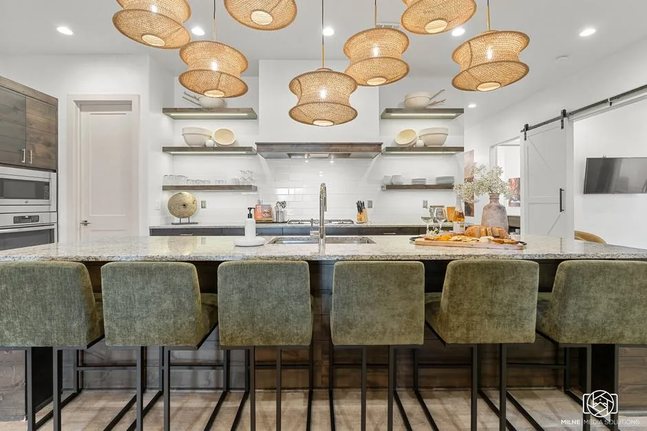
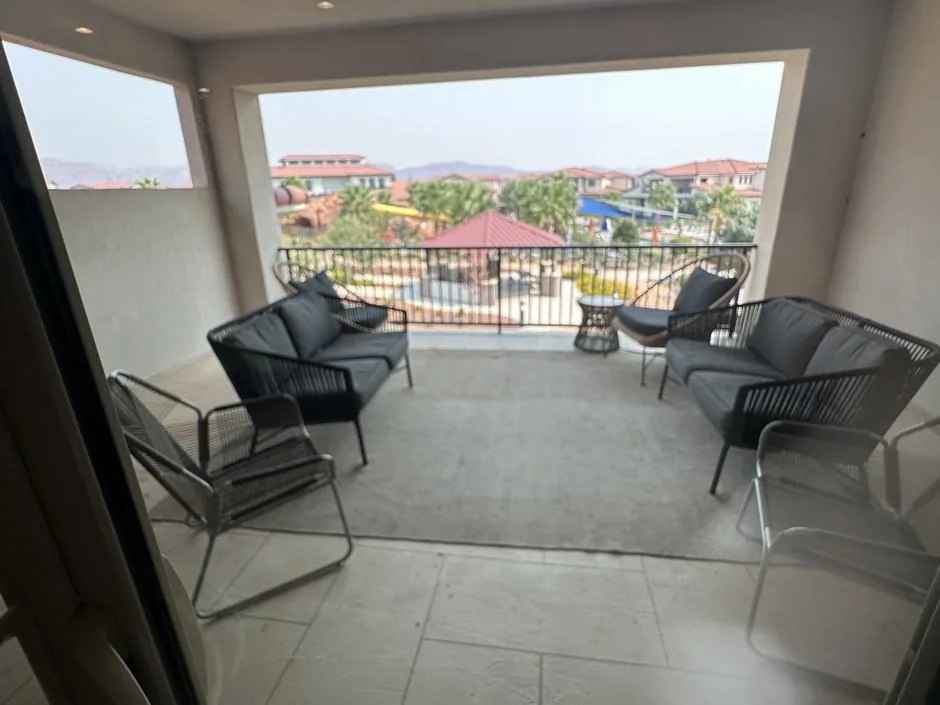
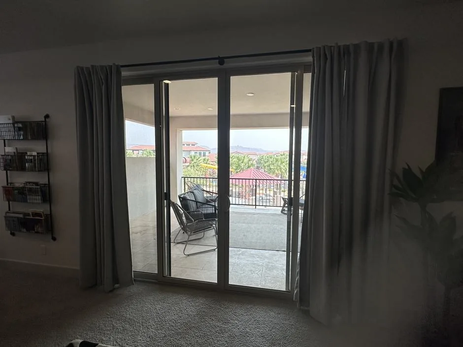
That floor also gets little direct sun because the covered patio runs 10 to 12 feet out past the sliding doors. A common fix is cool white light, but that makes a room feel sterile. We leaned into the darker room instead. An alabaster chandelier over the table and a few floor lamps give the space a warm glow. Over the island, an electrician added four fixtures to the original three, and we hung all seven at different heights with woven shades. The shades soften the glare, and the extra fixtures keep the room bright. The space ended up feeling brighter and cozier at the same time. Together, the mural and the chandelier give the main room a scene that stands out in the listing photos.
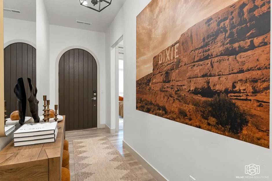
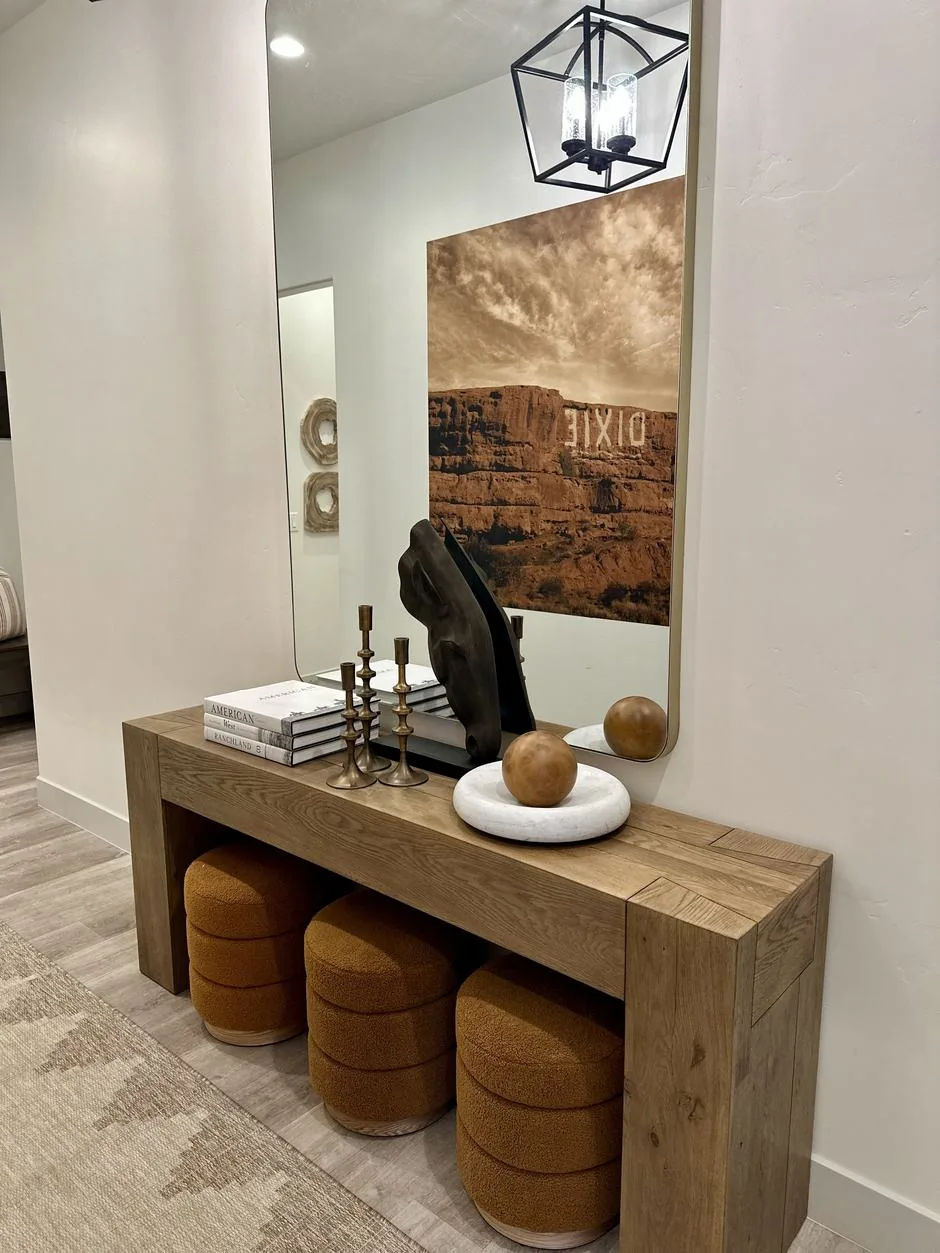
The owners wanted a Dixie Rock theme, since the rental’s name includes Dixie, the local nickname for the St. George area. We commissioned a photograph of Dixie Rock, a local landmark, in colors that match the dining mural, and put it in the entry where guests see it as soon as they walk in.
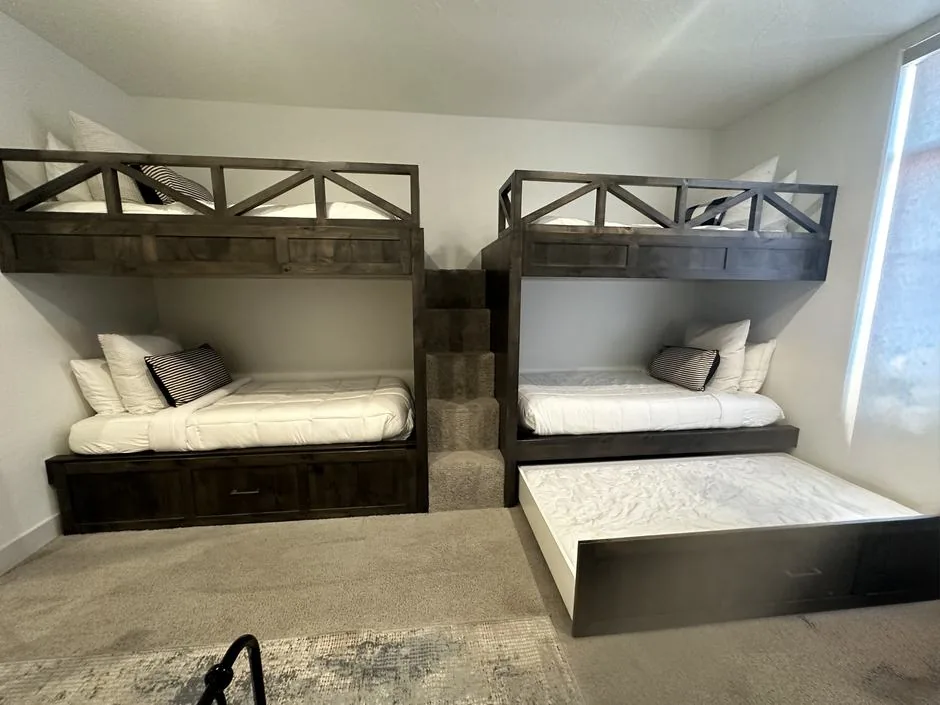
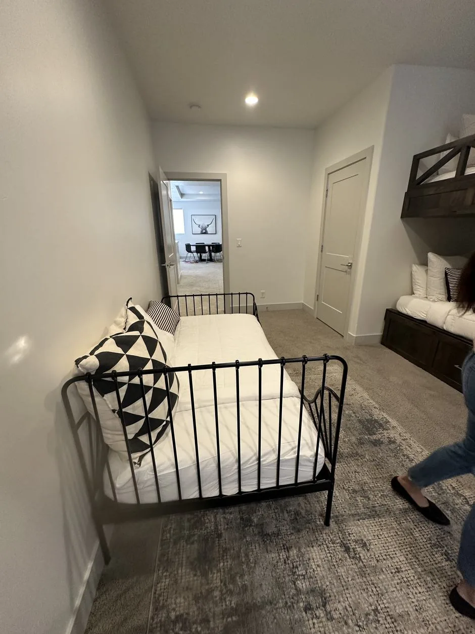
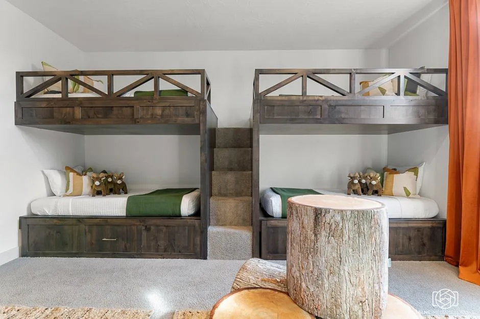
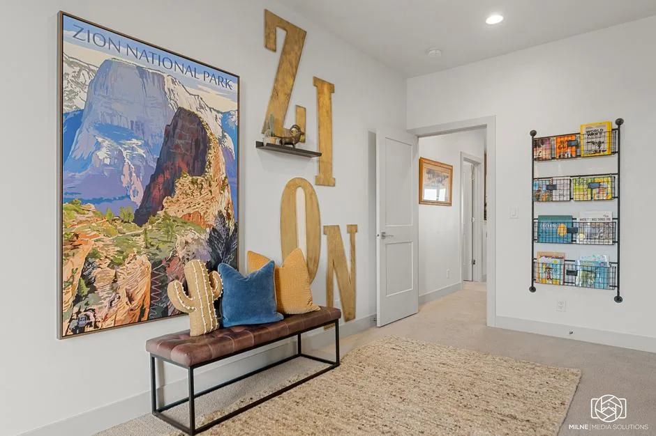
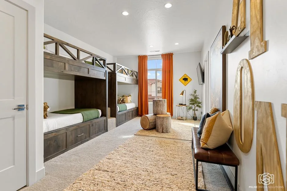
The bunk room had two bunk beds plus an extra twin bed you nearly walked into at the door. We took out the twin and used that space for seating. The owners wanted a national-park feel, so we hung a six-foot Zion artwork and big Z-I-O-N letters, added color and a rug, and brought in poufs that look like logs. Stuffed bighorn sheep, the animals people look for in Zion, sit on every bed, and they were the biggest hit with the owners’ grandkids. Out in the living area, we added a sit-down tabletop arcade game. Arcadia’s amenities already draw families, and when parents are choosing between similar rentals, what the kids will enjoy often decides it.
After the refresh, the owners told us the house was booking non-stop, and guests were taking better care of it. We’ve noticed that guests treat a place better when it feels cared for. A rental that has been running for a while also shows you what to fix. Here, the sofa bed that almost never got folded up showed us how guests were really using the house.